The Nokia Icon has been an adequate device. The boring design gives the Nokia Icon somewhat of an appeal, but there is nothing eye catching either about the Icon that makes it shout beauty in design. The Windows ecosystem for mobile is getting better by the update. With more features coming that improves the overall performance of the Icon. The new Cyan update should be available this week. Which will improve the overall design and performance on the Windows UI and UX on the Icon. While the mobile Windows store still falls short of being on the level of capacity of the Google Play Store yet alone the App Store for IOS. I was still able to find some of the apps I use on a daily basis. Such as Netflix, Twitter, Tumblr, and etc.
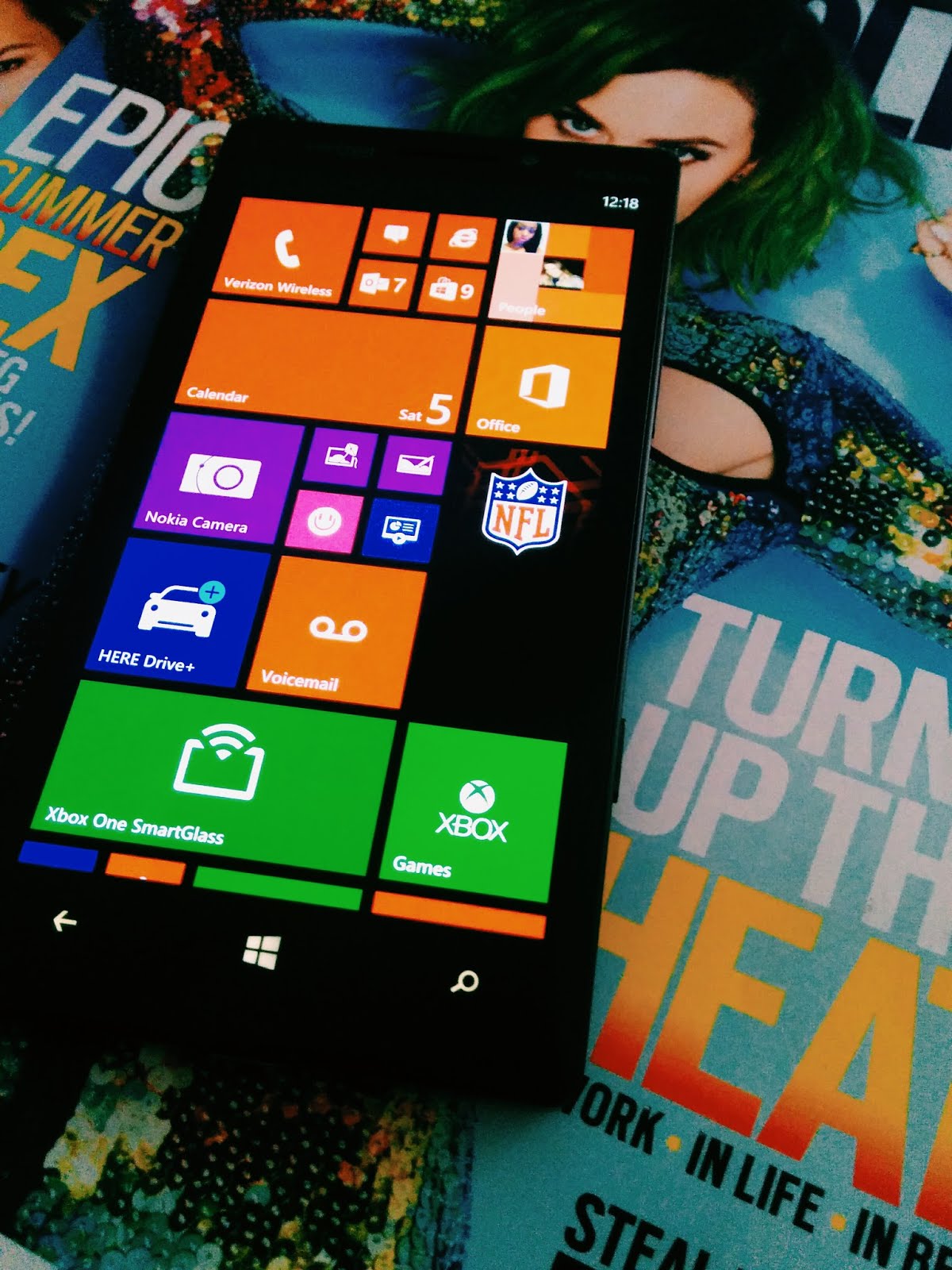
But finding any other useful productivity apps was awfully spare. The main attraction I have held with the Nokia Icon was that it has spectacular camera capabilities. With the Icon having its very own dedicated shutter button. I knew then that this device was serious about capturing the same quality of photography as a mid-range Canon.
After 2 months with the Icon I found difficulties with using it for my daily task. I would recommend this device to someone if they strive around using Microsoft applications such as SkyDrive, Outlook, and the Office Suite. Although for me I’m very Google App concentric from Google Docs to Blogger.
0 comments:
Post a Comment